
Thursday, 13 November 2014

Tuesday, 11 November 2014
Art Movements

Post Modernism
Post modernists work became popular from the 1960's onwards and it's a contemporary style of art that doesn't follow any specific or traditional structure like modern art does. In the post modernist era, artists wanted to experiment more and break boundaries by looking and working outside the box to show more of their individual skill and creativity. The style is somewhat messy and unorthodox and used by artists such as Banksy, Jasper Johns and Andy Warhol. These artists are relevant today and their work is often mysterious and leaves the audience questioning the meaning behind the piece of art. There are no rules with post modernist art.

Futurism
Futurism started in Italy in the 20th Century, futurist artists like to capture speed and movement in their artwork so the artwork often features moving vehicles like cars and planes. As well as that, geometric shapes are used also curves and jagged lines in contrasting colours or many different shades of the same colour. Some of the main players in futurism are David Bomberg and Filippo Marinetti who showcased his futurism artwork in a magazine called 'Le Figaro' in 1909. Futurist art work can be found in propaganda posters for the Soviet Union where the main colours are red and yellow as well as spoofs of political posters like a Captain America and an M&M's poster.The futurism art movement became politically dead although today some inspiration is taken from the style of futurism and an example of this is the poster for the film 'the Black Swan'.

Soviet Realism
The Soviet Realism art movement started during the Russian Revolution in the Soviet Union and was common for around 60 years. The goal of this art movement was to further the goals of communism and socialism by elevating the job of the common worker, to make working life look desirable. So the main feature of Soviet Realism art work are the workers of the Soviet Union. A notable artist from this art movement is Dmitry Moor, a Russian artist who is recognisable for his propaganda that were used in Soviet Russia in the 1920's. The Soviet Realism art work had a big impact on Russia in a political way because the propaganda was manipulative and used to increase and decrease the popularity of different leaders. However in this day and age the art style of Soviet Realism is old fashioned and out of date.

Art Nouveau
The movement of Art Nouveau meaning 'new art' started in 1880's France and spread throughout Europe. It can be recognised by it's swirly floral patterns, women are often incorporated into the design therefore the design is feminine and appeals more to a female audience. Some of the main players in the movement were Toulouse-Lautrec and Alphonse Mucha. The Art Nouveau style has influenced many man made designs such as furniture, jewellery, cosmetics (specifically perfume bottles), typo graphics using serif font and the tea company 'Pukka' use a very Art Nouveau style packaging for their products. After 1919 the art style was considered quite old fashioned and wasn't commonly used anymore although you still see some elements of the style ion decorative work.

Bauhaus
The Bauhaus art school delivered the very beginning of modernism in artwork. The German school was founded by Walter Gropius in 1919 and it closed in 1933. The work of the Bauhaus school introduced art on a linear grid pattern making it neat and uniform as well as the rule of using minimal, sans serif fonts and no more than three colours. Bauhaus work looks as though a lot of time has been spend making it fit a certain criteria rather than being extremely unique and creative. In a lot of Bauhaus style posters there is often a lot of white spice as the style is minimalistic, leading you just to focus on the main topics of importance.

Swiss StyleThe Swiss Style art movement is very similar to the style of Bauhaus in fact, Josef Brockmann, one of the notable Swiss style artist originally went to the Bauhaus school but left to further his design ideas. Swiss style uses the linear grid method in its work and it's also often used on a 45 degree tilt. Otl Aicher is another artist that used the Swiss style in his work. He designed the posters for the Munich Olympics in 1972 and he created the first ever mascot which is a Daschhund called Waldi. Due to it's modern look, Swiss style design is still used in the modern day. Ikea is an example of where the style is used and you can see in their advertisements and text that the linear grid is clearly used.
What I knew?
Before hand I had touched on some of these art movements in school art lessons, specifically the post modernist style. I have learnt a lot about Banksy's work and also recreated some work in his style before as well as focusing briefly on Jasper Johns and Andy Warhol when looking at pop art design. Apart from the Post Modernist movement, I wasn't previously familiar with any of the other art movements. I am sure I have seen art in their styles but I wouldn't have been able to pinpoint which art movement they were from.
What was the task?
Each group was given a specific art movement to focus on. We had to create a presentation that included information about the context (When/where is it from? Who are the main players? How can we recognise the work?), information about some of the key players from the art movement trying to focus mainly on poster designs if possible to relate to the project we're doing, trying to find any propaganda posters from each movement and finally we had to conclude whether art from each movement was successful, whether it's still relevant today and where do we see it used. Vicky and I focused specifically on the Swiss Style movement.
What do I know now?
As I was previously only familiar with the Post Modernist art movement I'm now familiar with all of the movements above. I would be able to recognise their style and say which art movement inspiration was taken from in posters I see today. Also I would feel comfortable applying these styles to my own work by knowing which styles were more successful in their work and which styles are still relevant today.
Researching Political Film
Films with political messages
Many of the films we watch and enjoy have hidden political messages, even childrens films. The 2014 Lego Movie is an example of this. The villain of the film named ‘President Business’ is thought to look similar to Mitt Romney although some others say that the film promotes the importance of hard work, creativity and ownership.
Aside from the Lego Movie, many children's films have a storyline where a problem occurs that needs to be solved and there is often one leader or two leaders in rivalry with each other, both convincing everyone else that they are the best leader fix the problem. A storyline like this has connotations of a political kind as politicians often battle against each other in times of crisis to prove to the people that they’re the one who can save things.
Women in politics
I would like my film to be based on female politicians as most politicians in this generation are male. I want the power of females to be recognised to show equality.

Michelle Obama- US First Lady
Queen Elizabeth- Queen of England
Margaret Thatcher- Prime minister of England 1979-1990
Rivalries between political parties
There is a known rivalry between politicians Ed Milliband and David Milliband who happen to be brothers. Ed beat David to the position of Labour leader leaving David as the less important brother.

Applying the sibling rivalry in politics theme to my film
I like the idea of using a sibling rivalry in my political film. I think it has the potential to be sincere or comical. Siblings often feel as though they’re able to get away with more when in rivalry with each other as deep down they will always have one anothers back. I could use a sibling bond as an advantage to make my film more exciting as it would be realistic for siblings to get into a manipulative and competitive disagreement.

Possible storylines
- Sisters who lost contact when they reached adulthood. They both arrive at a political debate as they are both MP’s for different parties. They automatically recognise each other and attack each other physically and verbally. Both get suspended from their positions as MP’s.
- A group of three sisters, twins and a younger sister. The family is heavily political and their father is an MP. The younger sister always feels left out so behind her families back she begins to become involved with an opposing party. Her family are very shocked and also amazed when they realise the power they’re younger daughter has and they feel threatened.
- Obama cheats on his wife with a politician from another party. His wife finds out but keeps it a secret. She stays with Obama and used his power and resources to gain power herself. In an election she gives a strong view and battles to replace Obama as president, becoming the female president and getting Obama and his affair suspended for being unprofessional.
Monday, 10 November 2014
Construction Toy- The Pick n' Mix Girls

Initial ideas
Here are the initial sketches that I drew for our groups construction toy. I came up with the idea for a doll that you can change the outfits of yourself, so young girls can create the doll that they desire, rather than the 'perfect' barbie doll that comes already complete from the shops.

Description of the construction toy
We have chosen to create an item called ‘’Pick ’N’ Mix Girls’’, we are going to have two dolls, one will be white/british and the other will be ethnic. The aim of this product is to make children creative and use their imagination to change the clothing and body parts of each doll. The dolls come with a birth certificate each so the name and age of the dolls can be chosen by the owner. The clothes we will provide will be very versatile, for example we are including a football shirt as well as a dress so the children will be able to understand the sort of clothing they like and their taste. The clothes will all be plastic so they will be able to clip together however the coat will be material so it can slip over the plastic clothing. We will not be making the dolls skinny like barbie, they will be a realistic size. If this product sells well on the market, we thought it would be a good idea to add a male version of the toy so it will be acceptable for both genders to enjoy.
Outfits
- A spotty dress that attaches to the doll at the neck with two holes at the bottom for legs and two on the side for the arms.
- A pair of jeans that have a nodule at the top that will be used to attach to a t-shirt. The jeans also have holes are the bottom to insert legs.
- A black skirt with a nodule at the top to attach a t-shirt and holes at the bottom for legs.
- A white vest with purple sweet, it has a hole at the top for the neck, holes in the arms and holes at the bottom to attach the trousers.
- A sports top, it has holes in the sleeve to attach the arms, hole in the neck for the neck and a nodule in the bottom to attach trousers.
- A black material coat, the coat fits over the plastic clothing, it has not nodules.
Reflection
I thought of a construction toy that was aimed at females as because I'm a female myself, I know what toys I enjoyed playing with when I was younger and what kind of toy I wish there were more of.
I liked this construction toy task as I worked in a small group and the project was collaborative. This meant that everyone in the group had their own input meaning the final design included everyones views and ideas. I learnt that collaborative projects are often more successful because each person can give their idea preferences meaning that a wider target audience will be reached.
If I was to do another project like this I would probably try and target the product at males or both genders so that I can show my thoughts are more diverse and it would also be more of a challenge designing something a male would like as I don't have personal experience of what boys are really interested in.
Monday, 3 November 2014
Textual Analysis- Political Posters
UKIP Poster

Purpose
To make people in Britain aware of how many people in Europe are looking for jobs and will do anything to get them. Britain is seen as a good place to find work as almost anyone is allowed to be employed, even if they are exploited by only getting paid a very minimum wage. The poster is literally pointing the finger so British citizens may feel like their personal jobs are at a threat of being taken away.
Aims
The poster aims to encourage the people of Britain to vote UKIP if they want to keep their jobs and not have them taken by non British citizens suggesting that Britain will only be controlled by British citizens if UKIP is in charge. Information about the day of the vote is also included to remind or initially inform people of the day they have to remember to vote to somewhat save the country.
Images
A photograph of an extremely large pointing finger is the only image on the poster, because this photo is so large it doesn’t leave room for any other photographs or images that may distract the attention away from the extremely striking finger. When looking at the image the angle it was taken and the shadow behind it makes it appear almost 3D, if this poster was on a large billboard I think the finger would be even more striking you you may feel taken aback when looking at it. This photograph does a good job or targeting individuals because without having to use the word ‘you’ we know that it’s ‘you’ who is being targeted because a pointing finger has connotations of targeting and addressing individuals.
Colour scheme
The photograph of the finger is on a white background which helps it to stand forward, the writing on the white background is black so it is also clear to read and it jumps out at you. Black and white are always good colours to use together if you want information or images to be directly noticeable as they are at completely opposite ends of the colour spectrum. The information is written in yellow on a purple background. Purple and yellow, which are bright and contrasting colours, are used for the the UKIP colour scheme so these colours have to be included somewhere on the posters to make it clear to the audience that this is a poster for UKIP.
Copy
Only direct and important information has been included on the poster. The statistic ‘26 million people’ has been used to present a true and shocking fact, the actual number of the people looking for work has been included because it is such a large number that many people in Britain would’ve previously been unaware of, if the number wasn’t so outstanding a word such as ‘many’ would’ve been used instead. The rhetorical question ‘And whose jobs are they after?’ is used so the audience ask themselves the question, the answer isn’t written on the poster but it doesn’t need to be as the image next to it makes it clear that it’s British citizens jobs that are being taken. If the audience have to ask themselves a question rather than just reading information, the statement will be more memorable to them. ‘Take back control of our country.. Vote UKIP’ is the information written in the area of the poster that used the UKIP colour scheme. By saying ‘take back control’ it suggests that the current country leaders don’t currently have control but voting UKIP is the way to regain this control.
Fonts
A serif font has been used which is uncommon with political posters that often use capital letters in a sans serif font. However, the text is still bold and easy to read as the serif font used isn’t complex or too fancy. The only sans serif font used is for the UKIP web address, this has to be accurate and easy to read in the way you will see it when you type it so it is clear and won’t be misunderstood.
Tone
A very blunt tone is conveyed by this poster as it is aimed to shock and eventually persuade the public to vote for UKIP. I don’t feel the the poster is particularly positive or negative it’s just an informative warning that also lets the audience know that UKIP will help support and control the country in a way that will be beneficial.
Impact
The UKIP campaign had a big impact on British citizens as they won the UK wide election in 2014. It’s likely that their bold and shocking posters helped them to win the campaign as they weren’t afraid to shock the public and present their controversial opinion about non British citizens taking jobs in the UK. Despite winning, the UKIP campaign also provoked a lot of conflict and disagreement during the time of the election but to UKIP leader, Nigel Farage, this was probably no bad thing as he probably saw all publicity as good publicity because with his strong posters and messages there was always an opportunity to sway voters opinions.
Conservative poster.
Purpose
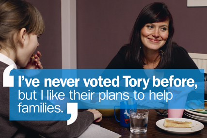
To show the Conservatives in a positive light. This is done by promoting them as a family friendly party who don’t just think about the state of the economy and the adult voters, they also care about young children and holding family bonds together.
Aims
By promoting themselves as a family friendly charity, the Conservatives will hope to convert people who wouldn’t usually vote for them to change their mind and vote for the better of their families. I think by having a poster dedicated to families, the Conservatives are working on a guilt trip suggesting that if you want to vote another party that you would vote for normally, you may just be voting for yourself and not for the wellbeing of your family.
Image
The entire poster is a photograph of a mother sat at the breakfast table with her daughter in shot opposite and to the right of her. The mother and daughter are the only two people in the picture but the mother is looking to her left and smiling suggesting that there is possibly another child or her partner sat next to her. The mother is smiling in a proud way almost like she’s thinking that she’s glad she voted for the Conservatives as she can now appreciate the time she gets to spend with her family because they have made it possible for her to be there. It’s possible that before voting for the Conservatives, the mother didn’t get to spend small but important moments like breakfast time with her children and that the Conservatives have helped create a family bond.
Colour scheme
For a positive poster, the colours used aren’t very bright. The image is clearly staged for the sake of the campaign so the campaigners could’ve set up the photo to be taken in a bright room with the participants in the photo wearing bright colours. However, the colours used are plain and fairly toned down which leaves an element of seriousness and realisticness in the photograph. If the colours were extremely bright and over the top it might’ve made the poster look sarcastic and too positive for a political campaign. To be taken seriously, political campaigns should keep colours minimal and classic. The text is is white so it stands from the colours in the photograph which are mainly dark.
Copy
The only text on the poster is a statement in quotation marks that says ‘I’ve never voted Tory before, but I like their plans to help families.’ As the mother is the main focus of the photograph on the poster, it suggests that the quote is coming from her as someone who normally votes for another party. I think the quote says that the mother is happy to vote for a different party than she normally would if they’re going to enforce policies that won’t just benefit her but will benefit her family as mothers are often very selfless and put their families first. The poster doesn’t explain what the Conservatives plans to help families are because if someone was to see this poster and the only information they saw was that the Conservatives plan on helping families this may be intriguing to adults with a family which would lead them to research what these plans are and then whilst researching these plans they will also be faced with some more of the positive plans the Conservatives are hoping to make.
Fonts
The font is sans serif so it is professional and easy to read. The first part of the quote ‘I’ve never voted Tory before’ is in bold therefore it stands out more and the audience pay more attention to it. I think this may’ve been written in bold so that you assume that this piece of information is shocking and you should question it.
Tone
The tone is very laid back and I feel that it’s quite unbiased. It’s presenting the Conservatives in a positive way without being too persuasive or forceful. I think by having a light and positive tone rather than being forceful in trying to persuade people to vote it works better for the campaign, although at some point they will have to be more persuasive it works better if posters are toned down and non offensive to the general public who see them when they’re out and about.
Impact
I think that the poster makes a positive impact as far as political posters go. It isn’t aggressive or attacking any other political posters which presents the Conservatives as a friendly and well mannered party, this may not be what the Conservatives are really like but as someone who doesn’t know what they’re like as a party in general, from this poster I think that they have done a good job of putting themselves across as a caring party with good morals.
Green party poster
Purpose
To show the Green party as an individual party that stands out from the rest in a positive way and that they’re capable of giving things that the other parties aren’t capable of or haven’t thought about doing. Also to make the Green party look like a ‘real’ option as many voters forget to consider the Green party in the election because they aren’t as aggressively forceful as the Labour, Lib Dems, Conservatives and UKIP.
Aims
To persuade and encourage voters to vote for Green in the election and also to inform voters about what the Green parties ideas and policies are, presenting them in a welcoming and positive way and a party that stands out from the rest in a good way. The Green party want to have the same power and importance as the other parties.
Image
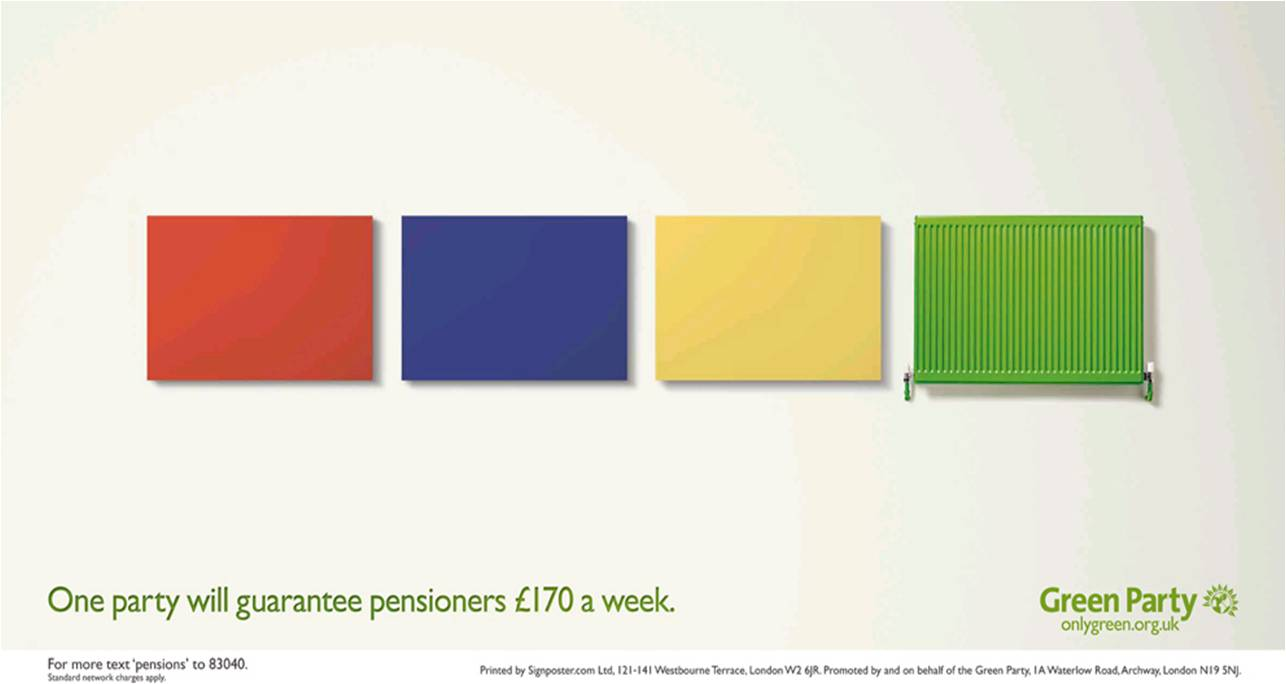
The image on the poster is four computer generated block coloured rectangles in red, blue, yellow and green; the colours of each of the parties excluding UKIP. The Green parties rectangle isn’t a blank block like the other three, it is a radiator which has connotations of warmth and support. As the other parties rectangles are blank it shows that they won’t be able to offer what the Green party is offering, I also think that because the other parties blocks don’t have any kind of image or alterations it presents them as blank, dull and that what you get is what you see on the surface. The rectangles are the only image on the poster apart from the Green party logo, therefore the impact the image makes is bigger as it is the first and only thing to grab your attention.
Colour scheme
The background of the poster is white therefore any other colour that’s used on the poster will stand out and be easily visible and clear. The text on the poster is written in green which is the obvious colour to use for the Green party. There is a small bit of text in black which says the text contact number for the green party, putting this in black slightly separates it from the ‘point’ of the poster as it isn’t directly related to the campaign on the poster, it relates to the whole party in general. The rectangles and radiator are red, blue, yellow and green, the primary colours, which are the easiest and least complex colours for us to look at as well as coincidentally being the colours that represent the other charities. The whole poster is bold and bright which makes it look fresh and positive.
Copy
‘One party will guarantee pensioners £170 a week.’ is the campaign phrase on the poster. The sentence doesn’t directly say ‘The Green party will guarantee pensioners £170 a week.’ I have found this with a lot of political posters, they often leave the audience to question what the poster is trying to represent but they do it in a way that makes the answer obvious so that the audience just have to confirm to themselves that the party on the poster is the best one. To guarantee something is a strong statement that wouldn’t be put on the poster unless it could definitely happen because if a party suggested that there was something they would like to do but nothing was definite then they would make it clear on the poster that it could be a possibility. However the Green party have said that they guarantee that they will give money to pensioners, this makes the party look strong and secure and that they have worked hard to get the results they want to help people in the community.
Fonts
A sans serif font is used so it is clear to read. If the font used was serif and the text was also in colour then it would be less clear therefore the information may not be consumed by all members of the audience. Making just the colour or the font itself, rather than both, look more visually attractive helps the poster to remain professional and neat.
Tone
The tone of the poster is positive for the Green party. It represents the other parties as less superior without slating them aggressively or too directly, the point of the poster is to make the Green party look the best but not to make the other parties look awful or claim that they’re the worst.
Impact
The message is powerful and promising which represents the Green party as a strong party that have a lot to offer. It proves that the Green party will do more than just turn the country into an eco friendly place where we will live off the land, they also have strong morals and will make a big impact on changing real problems that the country is facing.
Political Questionnaire Statement
From the political questionnaire we asked people around the college and the city of Bath, here are the results I discovered.


What was the task?
To come up with a range of questions to ask people in the age demographic 16-25 about their views and knowledge on politics. We then had to plot the results into a shared spreadsheet to get a wide range of results to analyse. Analysing the results meant making a statement about the facts we found and the assumptions we made from those facts.
What did I know at the start?
Before asking the questionnaire I was aware that any people in the age demographic of 16-25 wouldn't be heavily interested or informed about politics however I didn't expect that there would be people over the age of 16 who are unaware of who the British prime minister is as this is an age where everyone has been educated in school about the basic political situation and most people will have accessed some sort of information in the media about politics, the general election in particular.
What did I learn?
That there are people in the college who support specific political parties and intend on voting in the general election. I also learnt that most people access their political information online as it easy and available at any time, as well as accessing most political posters online, most people prefer digital posters to non digital posters.
How many people who’re old enough to vote support a political party?
Altogether, the questionnaire gives results for 51 people. 20 of these people were 18 or over and 6 of these over 18’s support a political party meaning that only 30% of the over 18’s we asked support a political party. Throughout the whole questionnaire, including the under 18’s only 7 people support a political party. The most popular party is Labour which has 3 supporters. 2 people said that they support a political party but did not state which specific party they support. Conservative and Green party each have 1 supporter and Lib Dem and UKIP have none.
The result of a young age demographic not being heavily interested in politics is a result that we expected. Many people in this age group will not be interested in politics as it is a rather complex and not extremely ‘fun’ subject to have interest in. Many teenagers and young adults may not choose to watch the television channels that give the public political information and it’s unlikely that this age demographic will read heavily political newspaper articles. We feel that under 18’s will probably begin intentionally researching political information when they’re old enough to vote.
The people that we asked that do have an interest in politics mainly access their political information online. Political information on the internet is available at any time and you can search any topic you want, whereas the radio and television coverage of politics gives you a fixed amount of information that won’t be as wide as what the internet can offer, although there is a lot of misinformation on the internet.What was the task?
To come up with a range of questions to ask people in the age demographic 16-25 about their views and knowledge on politics. We then had to plot the results into a shared spreadsheet to get a wide range of results to analyse. Analysing the results meant making a statement about the facts we found and the assumptions we made from those facts.
What did I know at the start?
Before asking the questionnaire I was aware that any people in the age demographic of 16-25 wouldn't be heavily interested or informed about politics however I didn't expect that there would be people over the age of 16 who are unaware of who the British prime minister is as this is an age where everyone has been educated in school about the basic political situation and most people will have accessed some sort of information in the media about politics, the general election in particular.
What did I learn?
That there are people in the college who support specific political parties and intend on voting in the general election. I also learnt that most people access their political information online as it easy and available at any time, as well as accessing most political posters online, most people prefer digital posters to non digital posters.
Construction Toys- Lego

The famous toy Lego, meaning 'play well' was created in January 1949. Lego is so popular that statistically each person in the world owns 86 Lego bricks. Lego is multicoloured interlocking bricks that you can use to construct anything you wish. Along with the construction bricks you can also get Lego characters and add ons to create specific scenes, for example, Lego offer Star Wars, Harry Potter, Princess and many more sets.
 |
| Here is a life sized Superman sculpture made entirely from Lego Bricks. |

However there are some cons. Although there are now some cheaper alternatives to Lego, the real Lego brand can be expensive to buy if you decide to expand your collection when the set you have is no longer challenging or interesting and when you have a large set it's inevitable that pieces will go missing and if you stand on a missing Lego piece it's uncomfortable to say the least! Another con is that Lego only works one way, there are nodules on the top and holes that fit the nodules on the bottom. You must get the top of one brick and the bottom of another perfectly aligned for them to work which may be challenging or time consuming for some people.
Due to the increase in popularity of Lego since it was first created, there are now many Lego Land parks worldwide. The parks have Lego themed rides along with Lego themed activities and much of the park is built purely from Lego.
I worked in a group with Issy Briggs and Jess Stockman, there links to their blogs are:
Issy- issybriggscobc.blogspot.com
Jess- jstockmanmediacobc.blogspot.com
Due to the increase in popularity of Lego since it was first created, there are now many Lego Land parks worldwide. The parks have Lego themed rides along with Lego themed activities and much of the park is built purely from Lego.
I worked in a group with Issy Briggs and Jess Stockman, there links to their blogs are:
Issy- issybriggscobc.blogspot.com
Jess- jstockmanmediacobc.blogspot.com
Subscribe to:
Posts (Atom)