Showing posts with label Poster. Show all posts

Tuesday, 9 December 2014

Focus Group- Biscuits And Posters


What did I know about Focus Groups?
I knew that a focus group meant getting a small group of people together, presenting them with a product and asking them their opinions on it, whether you give them a fixed set of questions or ask them the just speak their mind.

What was the task?
In small groups, we were given sample of two different types of cookie. Using Quicktime audio recorder, we sat around and discussed the cookies we tried referring to:

  •  First impressions
  •  Smell
  •  Texture 
  •  Taste
  •  Visual impression
  •  Quality and cost

After discussing the cookies for a few minutes, we discussed the pros and cons of this style of focus group compared to a written survey. 

What do I know now?
The pros of the focus groups were: the speed of response is quicker- you speak your mind straight away rather than thinking about what to write onto paper, the opinion you give is more detailed as it's less effort to speak your thoughts than to write down a long explanation, this means that your response is more honest as you don't have the time to think about altering it.

However there were some cons with this focus group. If you're sat with a group of people and someone shares their opinion then you may be influenced and agree with with people you're with rather than speaking your own mind. If the researcher has to listen to a 5 minute long piece of audio of qualitative information and pick out individual opinions rather than typing in simple qualitative research, it would be very time consuming and confusing to pick out exact opinions.


After doing the cookie focus group. I decided it would be a good idea to do a focus group to find out what people around the college think of my political poster design. I won't be asking them fixed questions but I will present them with points to refer to so that I can find out the information that will be helpful to me. These points will be as follows:

  • Target audience
  • Eye catching design?
  • Legible text?
  • Clear message?
  • Encourage you to vote?
  • Do you like it?
  • Best place to display?

Before I do the focus group I will hand out a quick survey just so I can get the demographic of the group of people.


Ryan, Maisie and I went into the crib to do a focus group with people from around the college to find out what they thought of our political poster designs. We presented them with the talking points and the demographic questionnaire. Above, is the audio from the focus group where they discussed their opinions and below are the results of the demographic questionnaire.


There were three people in our focus group, they were all male and they were all on the Sport BTEC L3 course. The varied in age from 17-19 however they're all eligible to vote next year in the general election. The 17 year old who will be 18 in March and the 18 year old will be voting next year but the 19 year old won't be. I wouldn't have expected males on the Sport course to be very interested or educated about politics so I am not surprised that one of the boys won't be voting and I would guess that the other two that will be voting haven't really thought about what the parties have to offer, they just said that they will vote purely because it's the first time their eligible. 

Here are the posters that the focus group looked at.


Monday, 1 December 2014

Poster Review


Above is my finished, printed poster. It turned out just as it looked on the screen in high resolution. Overall I am happy with my design however I would alter some aspects of it. The text is the main issue for me, I feel that a Bauhaus font would've looked better as the font I used looks a little bit basic and boring, almost as though I just used the original font that was preset. 
Also the alignment of the text could be slightly better, for example the 'find' is aligned with the edge but the 'visit' isn't aligned with the bottom edge so could be aligned better.

Tuesday, 25 November 2014

Thumbnail Designs

Here are some thumbnail style designs that I used as initial ideas for my final poster. I focussed on aspects such as shape, size and space.


Political Poster Design


After doing three designs on paper for my political poster, I decided that the design above would look the most successful as my final digital design. Using InDesign I used my paper design as a basis for my final design.


Before starting the design, I created four different layers to create each part of the poster on. By using different layers it makes mistakes easier to amend each section like the background, images, title and body text remain separate. 


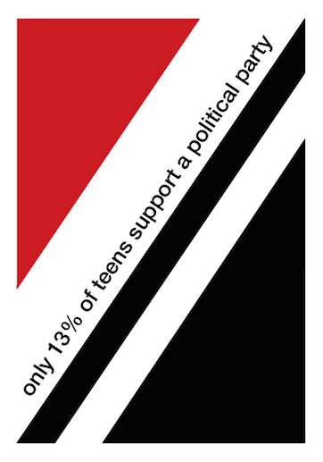
Starting with the background I began to develop my design. I first of all created my rotated grid style design by creating the red triangle which represents the 13% of teenagers that support a political party and the black triangle which represents the 87% teenagers who don't. 

As you can see, to begin with the triangles weren't aligned to the margin because on my design there was a small white border around the main design of the poster which I intended to also create on my digital design. However, I then realised that I could use the margins already on the document as my border and that would mean everything on the page would be better aligned.

As you can see, my design began to look neater after I made the triangles align to the margins on the page. 

On my original sketched poster design I intended on having the white strip for the rest of the text on the poster aligned with the base of my triangle but when I saw the design on screen I realised that it broke the grid design and that the white text rectangle should have the same rotation as the triangle. It also gave me more space for text.


For the text on my poster I used the font Helvetica Neue Medium as this is one of the only Swiss style fonts available in the poster, also I am happy with the way this font looks.

I began by having both lines of texts in the white gaps but I decided that the poster looked quite blank and that I wanted to add a more visual element to the poster. To do this it meant I had to have all of my text in the black triangle so that the white space above was clear for me to add something visual.


I wanted my visual element to represent a percentage as this is what the information on my poster is telling the audience. Above, you can see the different designs I tried to try and represent a percentage, using the hypotenuse line of the triangle as the percentage line.

This design is the one that I feel worked out the best. It is simplistic and easy to read, however I needed to add another bit of information linking to the 'find out who's worth supporting' that tells the audience where to look. This is what I added to it.. 

So this is my final poster design. It includes all of the facts and information I wanted to include and looks simplistic and neat like a Swiss style design. However I feel that it could look more professional in the area that I added the percentage sign visual. I tried lots of options to choose my favourite though so I think that I made it look the best I could.

What did I know before?
Before creating my poster on InDesign, I had more experience on paper so felt quite out of my comfort zone with the computer design. However I felt quite comfortable with the style of Swiss design so I knew what I pictured in my head.

What did I do?
I experimented using tools such as the polygon tool, layers and text to develop a design that I am happy with. I took inspiration from Swiss style after looking at different Swiss poster designs and concepts.

What I know now?
I am now more comfortable with how InDesign works and what I can do on it. It's very helpful that I know about looking at layers because it makes the design process smoother. I am confident with the Swiss style so in the future I would like to do a design in a different style to show a wider knowledge.


Monday, 17 November 2014

InDesign Practice

Using Adobe InDesign we work towards learning how to make a print publication in a Swiss Style with the grid method and minimal colours. After this we worked on our own poster design learning the skills we picked up.


Before this practice on InDesign, I had only used it for very basic interactive activities and I hadn't used it for designing anything based on a particular movement with specific rules and layouts. The only practice I'd had at designing posters in a Swiss style was by hand so I just used rulers and coloured pencils. Using InDesign makes it more specific therefore neater and closer to the style of the movement. 


As a class we all followed the steps to create a poster in a Swiss grid style. The content of the poster isn't relevant except from the title and small piece of text underneath, just to get some contrast between different sizes of text and how to lay them out. We worked with differnt layers making sure the background colour, title text and the main body text were all on different layers, just focussing on one at a time.


After creating a vertical, four columned grid and using filler text to fill up each column, we had to rotate the grid 35 degrees so that it reflected the Swiss style we were inspired by. By dragging the points on each corner of the text boxes on the grids, we were able to make the text legible and fit in the rotated grid.


After learning the basic structure of a Swiss style poster on InDesign, I started to work on one of my paper poster designs that happened to be a Swiss style to make my design more complete. Above is the start of my effort to create my poster.