UKIP Poster

Purpose
To make people in Britain aware of how many people in Europe are looking for jobs and will do anything to get them. Britain is seen as a good place to find work as almost anyone is allowed to be employed, even if they are exploited by only getting paid a very minimum wage. The poster is literally pointing the finger so British citizens may feel like their personal jobs are at a threat of being taken away.
Aims
The poster aims to encourage the people of Britain to vote UKIP if they want to keep their jobs and not have them taken by non British citizens suggesting that Britain will only be controlled by British citizens if UKIP is in charge. Information about the day of the vote is also included to remind or initially inform people of the day they have to remember to vote to somewhat save the country.
Images
A photograph of an extremely large pointing finger is the only image on the poster, because this photo is so large it doesn’t leave room for any other photographs or images that may distract the attention away from the extremely striking finger. When looking at the image the angle it was taken and the shadow behind it makes it appear almost 3D, if this poster was on a large billboard I think the finger would be even more striking you you may feel taken aback when looking at it. This photograph does a good job or targeting individuals because without having to use the word ‘you’ we know that it’s ‘you’ who is being targeted because a pointing finger has connotations of targeting and addressing individuals.
Colour scheme
The photograph of the finger is on a white background which helps it to stand forward, the writing on the white background is black so it is also clear to read and it jumps out at you. Black and white are always good colours to use together if you want information or images to be directly noticeable as they are at completely opposite ends of the colour spectrum. The information is written in yellow on a purple background. Purple and yellow, which are bright and contrasting colours, are used for the the UKIP colour scheme so these colours have to be included somewhere on the posters to make it clear to the audience that this is a poster for UKIP.
Copy
Only direct and important information has been included on the poster. The statistic ‘26 million people’ has been used to present a true and shocking fact, the actual number of the people looking for work has been included because it is such a large number that many people in Britain would’ve previously been unaware of, if the number wasn’t so outstanding a word such as ‘many’ would’ve been used instead. The rhetorical question ‘And whose jobs are they after?’ is used so the audience ask themselves the question, the answer isn’t written on the poster but it doesn’t need to be as the image next to it makes it clear that it’s British citizens jobs that are being taken. If the audience have to ask themselves a question rather than just reading information, the statement will be more memorable to them. ‘Take back control of our country.. Vote UKIP’ is the information written in the area of the poster that used the UKIP colour scheme. By saying ‘take back control’ it suggests that the current country leaders don’t currently have control but voting UKIP is the way to regain this control.
Fonts
A serif font has been used which is uncommon with political posters that often use capital letters in a sans serif font. However, the text is still bold and easy to read as the serif font used isn’t complex or too fancy. The only sans serif font used is for the UKIP web address, this has to be accurate and easy to read in the way you will see it when you type it so it is clear and won’t be misunderstood.
Tone
A very blunt tone is conveyed by this poster as it is aimed to shock and eventually persuade the public to vote for UKIP. I don’t feel the the poster is particularly positive or negative it’s just an informative warning that also lets the audience know that UKIP will help support and control the country in a way that will be beneficial.
Impact
The UKIP campaign had a big impact on British citizens as they won the UK wide election in 2014. It’s likely that their bold and shocking posters helped them to win the campaign as they weren’t afraid to shock the public and present their controversial opinion about non British citizens taking jobs in the UK. Despite winning, the UKIP campaign also provoked a lot of conflict and disagreement during the time of the election but to UKIP leader, Nigel Farage, this was probably no bad thing as he probably saw all publicity as good publicity because with his strong posters and messages there was always an opportunity to sway voters opinions.
Conservative poster.
Purpose
To show the Conservatives in a positive light. This is done by promoting them as a family friendly party who don’t just think about the state of the economy and the adult voters, they also care about young children and holding family bonds together.
Aims
By promoting themselves as a family friendly charity, the Conservatives will hope to convert people who wouldn’t usually vote for them to change their mind and vote for the better of their families. I think by having a poster dedicated to families, the Conservatives are working on a guilt trip suggesting that if you want to vote another party that you would vote for normally, you may just be voting for yourself and not for the wellbeing of your family.
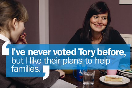
Image
The entire poster is a photograph of a mother sat at the breakfast table with her daughter in shot opposite and to the right of her. The mother and daughter are the only two people in the picture but the mother is looking to her left and smiling suggesting that there is possibly another child or her partner sat next to her. The mother is smiling in a proud way almost like she’s thinking that she’s glad she voted for the Conservatives as she can now appreciate the time she gets to spend with her family because they have made it possible for her to be there. It’s possible that before voting for the Conservatives, the mother didn’t get to spend small but important moments like breakfast time with her children and that the Conservatives have helped create a family bond.
Colour scheme
For a positive poster, the colours used aren’t very bright. The image is clearly staged for the sake of the campaign so the campaigners could’ve set up the photo to be taken in a bright room with the participants in the photo wearing bright colours. However, the colours used are plain and fairly toned down which leaves an element of seriousness and realisticness in the photograph. If the colours were extremely bright and over the top it might’ve made the poster look sarcastic and too positive for a political campaign. To be taken seriously, political campaigns should keep colours minimal and classic. The text is is white so it stands from the colours in the photograph which are mainly dark.
Copy
The only text on the poster is a statement in quotation marks that says ‘I’ve never voted Tory before, but I like their plans to help families.’ As the mother is the main focus of the photograph on the poster, it suggests that the quote is coming from her as someone who normally votes for another party. I think the quote says that the mother is happy to vote for a different party than she normally would if they’re going to enforce policies that won’t just benefit her but will benefit her family as mothers are often very selfless and put their families first. The poster doesn’t explain what the Conservatives plans to help families are because if someone was to see this poster and the only information they saw was that the Conservatives plan on helping families this may be intriguing to adults with a family which would lead them to research what these plans are and then whilst researching these plans they will also be faced with some more of the positive plans the Conservatives are hoping to make.
Fonts
The font is sans serif so it is professional and easy to read. The first part of the quote ‘I’ve never voted Tory before’ is in bold therefore it stands out more and the audience pay more attention to it. I think this may’ve been written in bold so that you assume that this piece of information is shocking and you should question it.
Tone
The tone is very laid back and I feel that it’s quite unbiased. It’s presenting the Conservatives in a positive way without being too persuasive or forceful. I think by having a light and positive tone rather than being forceful in trying to persuade people to vote it works better for the campaign, although at some point they will have to be more persuasive it works better if posters are toned down and non offensive to the general public who see them when they’re out and about.
Impact
I think that the poster makes a positive impact as far as political posters go. It isn’t aggressive or attacking any other political posters which presents the Conservatives as a friendly and well mannered party, this may not be what the Conservatives are really like but as someone who doesn’t know what they’re like as a party in general, from this poster I think that they have done a good job of putting themselves across as a caring party with good morals.
Green party poster
Purpose
To show the Green party as an individual party that stands out from the rest in a positive way and that they’re capable of giving things that the other parties aren’t capable of or haven’t thought about doing. Also to make the Green party look like a ‘real’ option as many voters forget to consider the Green party in the election because they aren’t as aggressively forceful as the Labour, Lib Dems, Conservatives and UKIP.
Aims
To persuade and encourage voters to vote for Green in the election and also to inform voters about what the Green parties ideas and policies are, presenting them in a welcoming and positive way and a party that stands out from the rest in a good way. The Green party want to have the same power and importance as the other parties.
Image
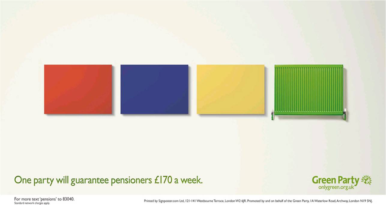
The image on the poster is four computer generated block coloured rectangles in red, blue, yellow and green; the colours of each of the parties excluding UKIP. The Green parties rectangle isn’t a blank block like the other three, it is a radiator which has connotations of warmth and support. As the other parties rectangles are blank it shows that they won’t be able to offer what the Green party is offering, I also think that because the other parties blocks don’t have any kind of image or alterations it presents them as blank, dull and that what you get is what you see on the surface. The rectangles are the only image on the poster apart from the Green party logo, therefore the impact the image makes is bigger as it is the first and only thing to grab your attention.
Colour scheme
The background of the poster is white therefore any other colour that’s used on the poster will stand out and be easily visible and clear. The text on the poster is written in green which is the obvious colour to use for the Green party. There is a small bit of text in black which says the text contact number for the green party, putting this in black slightly separates it from the ‘point’ of the poster as it isn’t directly related to the campaign on the poster, it relates to the whole party in general. The rectangles and radiator are red, blue, yellow and green, the primary colours, which are the easiest and least complex colours for us to look at as well as coincidentally being the colours that represent the other charities. The whole poster is bold and bright which makes it look fresh and positive.
Copy
‘One party will guarantee pensioners £170 a week.’ is the campaign phrase on the poster. The sentence doesn’t directly say ‘The Green party will guarantee pensioners £170 a week.’ I have found this with a lot of political posters, they often leave the audience to question what the poster is trying to represent but they do it in a way that makes the answer obvious so that the audience just have to confirm to themselves that the party on the poster is the best one. To guarantee something is a strong statement that wouldn’t be put on the poster unless it could definitely happen because if a party suggested that there was something they would like to do but nothing was definite then they would make it clear on the poster that it could be a possibility. However the Green party have said that they guarantee that they will give money to pensioners, this makes the party look strong and secure and that they have worked hard to get the results they want to help people in the community.
Fonts
A sans serif font is used so it is clear to read. If the font used was serif and the text was also in colour then it would be less clear therefore the information may not be consumed by all members of the audience. Making just the colour or the font itself, rather than both, look more visually attractive helps the poster to remain professional and neat.
Tone
The tone of the poster is positive for the Green party. It represents the other parties as less superior without slating them aggressively or too directly, the point of the poster is to make the Green party look the best but not to make the other parties look awful or claim that they’re the worst.
Impact
The message is powerful and promising which represents the Green party as a strong party that have a lot to offer. It proves that the Green party will do more than just turn the country into an eco friendly place where we will live off the land, they also have strong morals and will make a big impact on changing real problems that the country is facing.
No comments:
Post a Comment