
After doing three designs on paper for my political poster, I decided that the design above would look the most successful as my final digital design. Using InDesign I used my paper design as a basis for my final design.

Before starting the design, I created four different layers to create each part of the poster on. By using different layers it makes mistakes easier to amend each section like the background, images, title and body text remain separate.

Starting with the background I began to develop my design. I first of all created my rotated grid style design by creating the red triangle which represents the 13% of teenagers that support a political party and the black triangle which represents the 87% teenagers who don't.
As you can see, to begin with the triangles weren't aligned to the margin because on my design there was a small white border around the main design of the poster which I intended to also create on my digital design. However, I then realised that I could use the margins already on the document as my border and that would mean everything on the page would be better aligned.

As you can see, my design began to look neater after I made the triangles align to the margins on the page.

On my original sketched poster design I intended on having the white strip for the rest of the text on the poster aligned with the base of my triangle but when I saw the design on screen I realised that it broke the grid design and that the white text rectangle should have the same rotation as the triangle. It also gave me more space for text.

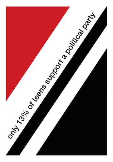
For the text on my poster I used the font Helvetica Neue Medium as this is one of the only Swiss style fonts available in the poster, also I am happy with the way this font looks.
I began by having both lines of texts in the white gaps but I decided that the poster looked quite blank and that I wanted to add a more visual element to the poster. To do this it meant I had to have all of my text in the black triangle so that the white space above was clear for me to add something visual.


I wanted my visual element to represent a percentage as this is what the information on my poster is telling the audience. Above, you can see the different designs I tried to try and represent a percentage, using the hypotenuse line of the triangle as the percentage line.

This design is the one that I feel worked out the best. It is simplistic and easy to read, however I needed to add another bit of information linking to the 'find out who's worth supporting' that tells the audience where to look. This is what I added to it..

So this is my final poster design. It includes all of the facts and information I wanted to include and looks simplistic and neat like a Swiss style design. However I feel that it could look more professional in the area that I added the percentage sign visual. I tried lots of options to choose my favourite though so I think that I made it look the best I could.
What did I know before?
Before creating my poster on InDesign, I had more experience on paper so felt quite out of my comfort zone with the computer design. However I felt quite comfortable with the style of Swiss design so I knew what I pictured in my head.
What did I do?
I experimented using tools such as the polygon tool, layers and text to develop a design that I am happy with. I took inspiration from Swiss style after looking at different Swiss poster designs and concepts.
What I know now?
I am now more comfortable with how InDesign works and what I can do on it. It's very helpful that I know about looking at layers because it makes the design process smoother. I am confident with the Swiss style so in the future I would like to do a design in a different style to show a wider knowledge.
No comments:
Post a Comment