Sunday 30 November 2014

Creating A Film Schedule

To make sure you do everything that needs to be done for your film process to run smoothly, you need to create a schedule that you can refer to regularly to see what you have completed and what you still need to do. Some of the key points I decided I needed to include in my pre-production schedule were:

Recce
Casting
Re-through
Transport
Shot list
Script locked
Storyboarding
Availability
Design
Crew
Risk Assessment

I looked at a range of different style schedules online so I could decide the best way to develop mine.

I think that the schedule above would be successful if there was less information inclued. It would be clearer and easier to follow if the schedule covered less people or if the timings weren't so specifc, by this, I mean that every 15 minutes of every persons day has been covered. If the schedules was made in half hourly or hourly sections, there wouldn't be as many sections therefore making it less crowded.
A good point about this schedule though is the use of colour. For example, if you want to see where 'reading' occurs you automatically know that you will find it in a dark green section. So I learnt that if there is going to be a lot of different activities in a schedule then colour coding each activity is easier for the person reading it, especially if the person reasing the schedule isn't the person who created it.


Above, is my own pre-production schedule. On the left you can see the 'to do' list, including everything I want to get done in the next three weeks I have to complete the pre-production stage of my film. Each week, I have two moving image lessons, so you can see I have separated the schedule into week 1-3 and then I've broken it down further so that each week shows the two lessons that I have. I have dedicated each lesson to one of the things on my 'to do' list. So that I know which activity I'll be doing that lesson, I've filled the block in red, to show that it's still to do. When I have completed a task I will change the block to green, then I will be able to clearly see that the red blocks are the tasks that I still need to complete. 

I plan to stick to this schedule as much as I can, however if I have any free time I will try and complete the tasks if it makes sense to do so at that specific time. If my schedule is unsuccesfull, then I will update it and also evaluate the changed I make.


Thursday 27 November 2014

Getting Teenagers To Vote- Political Campaign


Encouraging teenagers to vote can be difficult as politics always seems to be a boring subject that isn't really spoken about in day to day teenage life. However, if 18 year olds have the right to vote then why shouldnt they? It's time to encourage young people to make use of the vote that they've been allowed.

What are young people interested in?
No matter what style of genre, all young people enjoy listening to and engaging in music as it's something that you don't have to focus hard on, it's available whenever you want it and it  can make you feel happy and more settled in situations. 

How can music be used to get young people to vote?
There are a few different ways that music could be used to get young people interested in voting. Students from any course could work along side the music students to write a song that will appeal to everyone, that can be played in class and around college to enforce the message of the vote.
Another idea of using music could be to build up a college choir that could sing the voting song. If the debut of the song is well advertised around the college by the media students and arranged to happen at a time when a lot of students will be free to come and watch then groups of students may decide together that, if they are of age, they will remember or decide to vote.

How can the act of voting in the election be made interesting?
Political party broadcasts can be pretty boring and very unappealing to a younger audience, so if students from around the college from courses like media and performing arts could work together to produce a sort of 'parody' of political broadcasts, that still deliever the correct information, then it may add some comical value. Also, if students see their friends getting involved it makes the idea of voting more appealing to them as teeangers often follow the crowd.
The thought of having to leave the house and make a special journey to a specific venue to place a vote may put a lot of young people off of voting as it may be out of their way, they could feel intimidated by some of the older voters or they just can't fit it into their schedule. If there was a place in college where just college students could go to place their vote, a place where everyone feels as though they're of the same value and worth and that's easy to get to, college students may be more likely to vote in that instance.
Voting online would also be a good idea as all students in college have access to a computer and the internet and feel comfortable and at ease when they're using a computer. If college students knew that they could place their vote and it would only take a few seconds, most students wouldn't hesitate.

Which media formats would work?
Posters are always a good way of presenting information to teenagers as they can be big and bold. They are easier to look at than leaflets as all of the information is easy to read and to the point, rather than having to pick up a booklet and read a lot of detailed information. If there was a poster on the wall with key information, most students would read it without even realising.
As all college students use computers everyday at college, it would make sense to have some online content. Around the time of the general election in may, the Moodle home page could have a big, bold notice reminding students to vote. Also on this home page there would be clear links to pages where the students can find out more information.
Remaining along the lines of internet content, as well as the Moodle information, all students at the college could recieve a reminder email along with voting and party information that they are free to read at any time.

What would the style, content and information be like?
The posters and online information would have to be colourful and eye catching as dull and drab colours aren't very uplifting for teenagers and it enforces the idea that making a vote is boring, therefore colour must be used. It would be good to use images of popular famous faces or students around college as they will be familar to the young people at college therefore interesting and engaging them more. The information must be brief but clear and important. All that will be needed is information about when and where the voting will take place and just a few sentences on what each party aims to do, incase some students are completely unaware.

How would I go about researching this to find out..
What people at college currently think of politics/voting?
This is something I have already done in college, I produced a questionaire and asked students around college questions about their knowledge on politics, here are the results.
How to get young people interested in politics/voting?
As I know what courses Bath College has on offer, I can make an educated guess on what young people in the college are interested in. For example, if a voting campaign was musical then it should interest music students. If the campaign was promoted with lots of art work then the art students would pay attention to it or if lots of figures, facts and statistics were given then the business students may want to get invloved. As a teenager, I know what teenagers are interested in meaning I know the things that would grab their attention.
What media I could create to promote voting?
If there was a survey on the Moodle homepage asking students what they look at regularly e.g. internet, blogs, social media, magazines, tv, books, I would know where to put the information about my campaign. Which ever media format gets the kost attention from teenagers would be the best place to promote my campaign.

Inside Llewyn Davis Podcast


This is my podcast where I talk about the soundtrack of the film 'Inside Llewyn Davis' enjoy!

Research Report


What is research?
To research something is to investigate a topic with the intention of finding information to develop upon. You will often approach your research task with a research question, this is the question that all of the research you gather together will give the answer to. Before creating any type of product in media you must do research beforehand so that you have something the base your idea upon. If you go into a project without any research, your product is more likely to be unsuccessful than if you do research beforehand.

Qualitative and Quantitative Research
If you want to know people opinions and their comments on products and topics then you will do qualitative research and if you want fixed answers like figures and statistics then you would do quantitative research.

Primary Research
Primary research is new research that is up to date and relevant to your exact research question, you can do primary research yourself or as part of a team so you can define exactly what needs to be found out.

Secondary Research
Secondary research is making use of the information that has already been studied before however with secondary research you must always credit the source as well as being careful that the information is answering your research question.

Audience Research
Audience research is collecting information from a specific demographic based on factors such as: age, gender, ethnicity, location or religion to find out what appeals to them and what they’re looking for. 

Market Research
Market research is looking at what the market already has to offer and what is popular with different demographics, if you know what is successful or unsuccessful in the current market you can use this as a bass for your own product. 

Production Research
Production research is the research that helps you discover the resources, materials and permissions you will need to make your product possible and suitable for the market and demographic you want to target.

Primary Research- Pros&Cons
For each type of research there are pros and cons. Primary research is done using questionnaires, focus groups and surveys. It can be very accurate and specific for the exact question you want to answer, however if you don’t make your questions clear or clearly present what the aim of your research is, it may be misinterpreted therefore the information you collect may not be useful. With primary research you need to be very organised and make sure that information doesn’t get lost and you need to be sure that you will have all the information you need, when you need it. 

Secondary Research- Pros&Cons
Secondary research can be found on the internet, news reports, magazines and books. It’s is a good method because you can see how products have developed and changed over time from the point of view of different sources though secondary research isn’t always reliable, it is often false information and can also be very biased which may be helpful or unhelpful depending on what you’re trying to discover. 

Audience Research- Pros&Cons
The pros of audience research, which is done similarly to primary and secondary research, is that you can collect information from the specific people you’re trying to target meaning that your research process will be more to the point but if you just collect information from a specific demographic you may isolate your product from appealing to any other demographics.

Market Research- Pros&Cons
Market research is done by doing similar things to primary and secondary research as well as price analysis, marketing maps and identifying trends. It is very necessary and helpful to do market research because it helps you to discover whether your product will sell, however at this point you may get a lot of mixed views and reaction and worst of all you may get a bad reaction, your product may not meet the markets requirements meaning that you’d have to start again and work on changing it. 

Production Research- Pros&Cons
Production research is done at the beginning and the end of building a product. It is similar to market research in the fact that if you are unable to get hold of the resources and funding you need then your product won’t be able to go ahead although if you are successful then you can go ahead with post production and expanding on drafts and pilot episodes.


Media producers always need to research when thinking about developing a new product because their product needs to stand out from everything that already exists to sell and because even more popular than the rest. They need to find out about market gaps and audience needs and success amongst other products so that they are well informed and capable of tackling the problems they face as they will be aware of similar problems that may have happened in the past. Although researching may be time consuming and a long process to do, I feel that it all completely necessary. Researching means that when you face problems you will know how to go about solving them and always link back to the information you have gathered. If you were to just base a product upon what you wanted personally, you would be unsuccessful in the market as the main point of creating a product is delivering exactly what the audience wants.


Tuesday 25 November 2014

Thumbnail Designs

Here are some thumbnail style designs that I used as initial ideas for my final poster. I focussed on aspects such as shape, size and space.


Political Poster Design


After doing three designs on paper for my political poster, I decided that the design above would look the most successful as my final digital design. Using InDesign I used my paper design as a basis for my final design.


Before starting the design, I created four different layers to create each part of the poster on. By using different layers it makes mistakes easier to amend each section like the background, images, title and body text remain separate. 


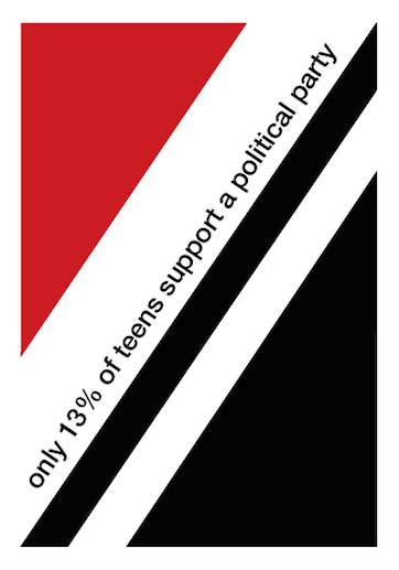
Starting with the background I began to develop my design. I first of all created my rotated grid style design by creating the red triangle which represents the 13% of teenagers that support a political party and the black triangle which represents the 87% teenagers who don't. 

As you can see, to begin with the triangles weren't aligned to the margin because on my design there was a small white border around the main design of the poster which I intended to also create on my digital design. However, I then realised that I could use the margins already on the document as my border and that would mean everything on the page would be better aligned.

As you can see, my design began to look neater after I made the triangles align to the margins on the page. 

On my original sketched poster design I intended on having the white strip for the rest of the text on the poster aligned with the base of my triangle but when I saw the design on screen I realised that it broke the grid design and that the white text rectangle should have the same rotation as the triangle. It also gave me more space for text.


For the text on my poster I used the font Helvetica Neue Medium as this is one of the only Swiss style fonts available in the poster, also I am happy with the way this font looks.

I began by having both lines of texts in the white gaps but I decided that the poster looked quite blank and that I wanted to add a more visual element to the poster. To do this it meant I had to have all of my text in the black triangle so that the white space above was clear for me to add something visual.


I wanted my visual element to represent a percentage as this is what the information on my poster is telling the audience. Above, you can see the different designs I tried to try and represent a percentage, using the hypotenuse line of the triangle as the percentage line.

This design is the one that I feel worked out the best. It is simplistic and easy to read, however I needed to add another bit of information linking to the 'find out who's worth supporting' that tells the audience where to look. This is what I added to it.. 

So this is my final poster design. It includes all of the facts and information I wanted to include and looks simplistic and neat like a Swiss style design. However I feel that it could look more professional in the area that I added the percentage sign visual. I tried lots of options to choose my favourite though so I think that I made it look the best I could.

What did I know before?
Before creating my poster on InDesign, I had more experience on paper so felt quite out of my comfort zone with the computer design. However I felt quite comfortable with the style of Swiss design so I knew what I pictured in my head.

What did I do?
I experimented using tools such as the polygon tool, layers and text to develop a design that I am happy with. I took inspiration from Swiss style after looking at different Swiss poster designs and concepts.

What I know now?
I am now more comfortable with how InDesign works and what I can do on it. It's very helpful that I know about looking at layers because it makes the design process smoother. I am confident with the Swiss style so in the future I would like to do a design in a different style to show a wider knowledge.


Monday 24 November 2014

Colour Harmony

After looking around town and college for all of the different colours that are used, I gathered as many as I could and placed them onto a colour wheel in the place that they best fitted. It was difficult to find examples of magenta and cyan in real life as they are most commonly used in printing.

I looked at colour harmony to see which colours work well together in design and which colour schemes clash and should be avoided. Here is a document explaining how colour sequences work and should be used.

To test out how the different colour harmony sequences worked I designed a few simple posters as examples.


Complementary


Analogous


Rectangle

Friday 21 November 2014

Linear and Nonlinear Narratives

A linear narrative is a storyline with a regular structure. It starts at the begining, has a middle section and then has a clear ending, everything happens in chronological order. The three acts are differnt lengths, the middle act is always the longest and the first and last ones are shorter as they just introduce and conclude.

An example of a film with a linear narrative is The Hunger Games.


Nonlinear narratives are more complicated and less commonly used. They are disjointed and often follow more than one storyline or point of view. The different acts will be set at the same time but following from different people aspects. Eventually at the end you will realise where each part of the narrative fits in and the story will become clear.

Pulp Fiction is an example of a film with a nonlinear narrative.


Monday 17 November 2014

InDesign Practice

Using Adobe InDesign we work towards learning how to make a print publication in a Swiss Style with the grid method and minimal colours. After this we worked on our own poster design learning the skills we picked up.


Before this practice on InDesign, I had only used it for very basic interactive activities and I hadn't used it for designing anything based on a particular movement with specific rules and layouts. The only practice I'd had at designing posters in a Swiss style was by hand so I just used rulers and coloured pencils. Using InDesign makes it more specific therefore neater and closer to the style of the movement. 


As a class we all followed the steps to create a poster in a Swiss grid style. The content of the poster isn't relevant except from the title and small piece of text underneath, just to get some contrast between different sizes of text and how to lay them out. We worked with differnt layers making sure the background colour, title text and the main body text were all on different layers, just focussing on one at a time.


After creating a vertical, four columned grid and using filler text to fill up each column, we had to rotate the grid 35 degrees so that it reflected the Swiss style we were inspired by. By dragging the points on each corner of the text boxes on the grids, we were able to make the text legible and fit in the rotated grid.


After learning the basic structure of a Swiss style poster on InDesign, I started to work on one of my paper poster designs that happened to be a Swiss style to make my design more complete. Above is the start of my effort to create my poster.

My Poster Designs

Here are some poster designs based on some of the art movements we covered. The annotations on each poster describes what my aim was and how the design reflects the art movement.


I apologise for the poor image quality on the image above. The colours were very pale because I wanted the design to be as close to the Soviet Realism movement as possible however the annotations should explain my aim of the poster.

Before this project I wouldn't have though about looking at a specific design for influence when designing a poster or document. The only one of the movements I'd taken inspiration from before was post modernism because I had studied Banksy's work in art.

The task was to present my political message in a poster using inspiration from the different art movements so I wanted to choose ones I hadn't previously focussed on.

Now I would be confident to work in the style of different art movements especially the Swiss Style because I like how you can follow a pattern and grid and just use a few primary colours. It keeps the design process fairly simple and it looks neat in the end.

Colour Association


All colours convey different feelings and emotions but how they're used and what they're used for. Red is a colour that can have contrasting meanings, for example, red can often mean 'danger' or 'stop' when you see it used on road signs and traffic lights however it can also mean love and romance as it's the main colour used for love hearts and the theme colour of valentines day is red. If a female wears red lip sticks she will automatically give of a feminine and sexy vibe which is a complete contrast to red's connotations of danger.

I think that blue only has one type of emotion attached to it. A calming and soothing feelings usually present where blue is used. If you go to a spa or a pool, one of the only colours used is blue but in many shades, along with white. If you go to a spa and the colour of everything is blue, you feel relaxed because especially paler shades of blue are easy on the eye and non-offensive. If the colour red was used in a spa, you wouldn't feel so relaxed and the other shades of red will always become darker as if you make red lighter it turns to pink. In a spa you want the atmosphere to be light and fresh, not dark and heavy.

The colours yellow and pink always uplift me. They're bright and happy colours so are used for upbeat and uplifting products and situation. 

Smiley faces are classically yellow along with spring flowers, and children's toys like rubber ducks. Yellow is a primary colour therefore it's in it's simplest form although it can be extremely bright or muted down if you want it to be easy to look at for example a lot of new born babies clothes and decor are often a very pale shade of yellow.

Pink is a feminine colour. It's the traditional stereotypical colour for girls so almost all baby girls clothes and clothes for young female children are pink  to show the clear line between girls and boys. The stereotype of pink being a 'girls colour' mainly just lasts for childhood because as we get older we are more open to accepting and trying new things and breaking gender stereotypes.

Friday 14 November 2014

Scene Selection- Harry Potter

I have chosen to look at the scene in Harry Potter and the Philosopher's Stone where the children get their first look at Hogwarts, lead by Hagrid.


One of the first shots used is of Hagrid. He is addressing all of the children and giving them instructions. Hagrid is an important character at this point and the well being of all of the students depends on him and his power is emphasised with a low angle look at him. Compared to a normal human Hagrid is abnormal tall and large but as in real life he's just a slightly larger than average sized man, shots have to be used strategically to make him look even bigger. If I didn't know the character of Hagrid, at this point of the scene I would probably think he was a threatening character because of what he looks like and the way he is presented with camera shots, evil characters are often filmed at a low angle to make them look above everyone else. With Hagrid though, the low angle is purely just to emphasise his size and dominance. 


This is a particularly interesting shot that primarily included Hagrid, Ron and Harry as the focus but coming in from the background you can also see Hermione and some other students approaching. At this point, no one else apart from Harry is familiar with Hagrid so this is the first time they're experiencing his vast size. An over the shoulder high angle has been used to make the students look way below Hagrid and to show their feelings and thoughts when they see how big Hagrid is. By making the children look a lot smaller than average at first it helps the audience to understand what the children must have been thinking. Without speaking to or getting to know Hagrid, they were probably scared of him to the camera angle used enforces this idea.


A wide angle is used as the students approach Hogwarts for the first time. In the wide angle we can see the lights of the boats and silhouettes of the students, in the mid ground we can see a mysterious fog that is enticing and makes the Hogwarts building in the background immediately look mysterious. I don't think that Hogwarts is looked up at from a low angle shot in this scene but because of it's huge size and the fact it's based upon some sort of rock, it does look as though everyone approaching in the boats are probably looking up at it in awe of it's size and mystical appearance. All of the students and even Hagrid at the front look tiny in comparison to Hogwarts and although Hogwarts is a building not a character, we know that it's going to be one of the most important things in the film as it over takes even the largest character in size, it has the most wow factor out of everything we've been introduced to so far.


The camera switches from the students approaching Hogwarts, with the school as the main focus of the shot, to a medium shot of Harry and Ron's faces as they approach the school. The boys are looking up which confirms to the audience that Hogwarts is probably bigger and more grand than anything the boys have seen before as they have to gaze up to clearly see what it all looks like. The camera is close enough to the boys for us to see the expressions on their faces as they look at Hogwarts for the first time, Ron has his mouth wide open which is a sign of real shock and Harry is close to that but as a more reserved character than Ron he is probably holding some of his amazement in. 

This whole scene is full of emphasis as this is the very start of everything that will happen in Hogwarts during Harry and Ron's time as students. I think it's correct that Hagrid and Hogwarts have been presented as extremely grand and shocking characters as this is one of the most iconic moments of the whole Harry Potter series and if the students didn't look impressed or if everything just looked 'average' to the audience, it wouldn't intrigue us to watch more or think that there would be exciting things to come.


Thursday 13 November 2014

Why do we do a recce?


Here is a visual representation of why we do a recce, above are all of the things you have to look for and think about when you go to a location that may possibly be the location for your filming.

Comparing locations
We looked at two different locations with the intention of finding a setting for a romantic sci-fi film. 


The first location was a play park. It was a slightly larger location that covered a wider area of varied land, by this I mean that there were different slopes, hills and craters with trees mainly around the outside. As it's a play park, it comes filled with different play equipment that may or may not be suitable for you film, with the play equipment there you would have to fit it into your film somehow. This location was very close to a busy road, meaning that there was a lot of noise from traffic which would interfere with the filming unless you wanted a busy traffic filled scene. 


In my opinion I think that the second location we looked at would be more suitable. The space was more empty an open, there were a few slopes that would look good as craters in a sic-fi film but they wouldn't be a hindrance if you just wanted a large, flat, open space. As this is an open area of grass, there is no play park equipment meaning that it's down to the director and gives the director more freedom when it comes to bringing in props and building up the scene, as the only existing features that would have to be included are the trees and surrounding houses. The sound at this location would also be better because it's not next to a busy road, however wen we went to look at the location there were dustbin trucks that were an eyesore and main an unpleasant sound.

Whenever you do a recce at a location for your film, you will almost definitely find cons about the area but if you're willing to improvise you can overcome these issues. You have to weigh up the pros and cons of each location and chose the one that suits your film the best and is the most practical when it comes to transporting a cast and crew, accessing power and sanitation and lighting and weather issues. I feel that there should always be some flexibility in the script that gives you room the alter some aspects of the film to fit with a location if the perfect location isn't available to you at the right time.


Mini Research Project- Zoella Presentation


Mini Research Project- Primary Questionnaire Results

I gave my questionnaire to 14 people from group A and group B, both male and female, to answer so I could get a good range of results.


I expected similar results to this for this questionnaire, as almost everyone will be exposed to Youtube videos most days even if they’re unaware of it. For example, there are a lot of direct links on Facebook and Twitter to youtube videos that play automatically as you scroll down your news feed therefore most people will view a Youtube video without going directly to Youtube and searching for a video on a specific topic.


‘Vloggers’ are now becoming some of the highest subscribed to channels on the whole of Youtube. They will typically speak about everyday topics like what they enjoy, what annoys them, the products they recommend and some of these vloggers even go as far as filming everything they get up to each day just to share with the internet. There are vloggers out there to suit almost any audience although discovering the vlogger that is right for you is a little harder than just searching for a music video or a cheat for a level on a game. The result of this question doesn’t surprise me as I am aware that a lot of teenagers are very interested in vloggers and dedicate a lot of time to watching their online content, however, I am also aware that a lot of teenagers haven’t discovered the vlogging side of Youtube as they don’t spend enough time just browsing Youtube, mainly just typing in the exact video they want and watching just that.


There was another option in this question which was gaming, as I am aware that gaming channels, like PewdiePie who has over 31 million subscribers, are some of the most popular channels on Youtube. No one within the group of people I asked chose gaming as the type of video they spend the most time watching on Youtube but this doesn’t mean that my results were inaccurate it just means that gaming videos may be more popular with a different age range or people from different parts of the world like China that has a very popular gaming culture. The most popular genre of Youtube video with the group of people I asked is music which isn’t surprising as it is a quick and free way to watch music videos and find almost any song you want, whenever you want. It doesn’t involve having to sign up or creating a playlist, however you can do so if you want. So it’s an easy and widely accessible way to listen to and find new music.


Over three quarters of the people who answered my questionnaire are familiar with who Zoella is, even if they aren’t a dedicated fan or viewer, most of the group are aware of who she is. If I asked this question a few months ago I would have expected less people to know who Zoella is but in the past month she has released her own range of bath products, has her own advert on TV, has her face on billboards nationwide and an advertisement for her Youtube channel is often featured on the Youtube homepage whether you’re subscribed to her or not and whether you have your own Youtube/Google account or not. All of this exposure means it’s unlikely that anyone hasn’t seen her name or face pop up at least once during their time on the internet, watching television or walking down the street.